Sensory Tint is a companion app that applies a coloured overlay to your entire Windows screen. Unlike the per-document Background Colour feature, Sensory Tint affects everything you see — websites, applications, file explorers, video — providing system-wide visual stress relief without modifying any document.
Video help
A walkthrough of Sensory Tint, so you can see it in action without leaving this page. The video only contacts YouTube once you press play.
What Sensory Tint does
Sensory Tint sits between you and your screen as a tinted layer. It doesn't change any pixels in any application — it simply colours everything you see in your chosen tint. This means:
- Web pages, documents, videos, photos, games — all are tinted equally
- No application is modified — turn off Sensory Tint and everything returns to normal
- Documents you save are unaffected — others won't see your tint
- Screenshots typically capture the underlying screen, not the tint
The four modes
Sensory Tint offers four overall display modes, selectable from icons at the top of its window:
- Full Colour — your chosen tint is applied as a coloured overlay across the whole screen
- Mono — a monochrome (greyscale) overlay, removing colour entirely; helpful for some forms of visual stress where colour itself is distracting
- None — no tint applied (a quick way to compare with and without)
- Inverted — inverts the screen colours; useful for some users with light sensitivity, similar to dark-mode for the whole desktop
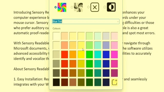
Choosing a colour
Below the mode icons, Sensory Tint offers two routes to a colour:
- Preset tints — a pull-down list of named presets (e.g. Blue Tint, plus other commonly-recommended Irlen-style colours). The list also includes adjustments designed to assist with colour vision deficiency — these aren't tints but colour transformations that re-map the screen palette to be more distinguishable for colour-blind users.
- Colour palette — a grid of swatches covering the spectrum, from pale pastels through to strong shades. Click any swatch to apply that colour as the tint.
Custom colours
If none of the swatches match the colour you want — for example a specific Irlen-prescribed tint — you can add custom colours to the palette using the + button at the bottom right of the grid. Custom colours persist between sessions.
How to use Sensory Tint
- Launch Sensory Tint from the Windows Start menu
- Choose a colour from the palette
- The tint applies immediately to your entire screen
- Sensory Tint remains in the Windows taskbar — click the icon any time to change colour or turn off
Sensory Tint with Readable
Sensory Tint and the main Sensory Readable application work alongside each other without conflict. You can have:
- Sensory Tint colouring your entire screen (e.g. pale yellow overlay)
- Readable speaking and highlighting words on a Word document
- Background Colour applied to the document itself (a separate, document-specific colour)
The three combine well — the document has its own background colour, Readable's speech and highlights work normally, and Sensory Tint provides the overall calming tint to everything else on screen.